HSE University, School of Linguistics, Moscow
A DOI for this manuscript is https://doi.org/10.5281/zenodo.13293622.
This manuscript (permalink) was automatically generated from nevmenandr/vindolanda@e3b34cd on September 3, 2024.
Published: August 11, 2024
✉ — Correspondence possible via GitHub Issues or email to Boris Orekhov <nevmenandr@gmail.com>.
Vindolanda is an open-source and free font that reproduces the letterforms in Latin manuscripts found during excavations at a Roman auxiliary fort in northern England. Most of the letters in this font copy the writing on the wooden tablets from Vindolanda, i.e. early Roman cursive, but in a strict modern sans-serif, which allows you to combine the originality of the lettering in manuscript documents with the beauty of regularity in the typographic era. The font can be used for more authentic reproduction in books and on websites of texts written in Roman cursive, as well as for educational purposes to practice reading texts written in Roman cursive. Uppercase and lowercase letters are not distinguished. In addition to the letters of the Latin alphabet, the font contains the letters of the Cyrillic alphabet and the extended Cyrillic alphabet for minor languages. These letters were created for entertainment purposes and have no historical basis.
This document presents a typeface that reproduces the appearance of the Roman cursive [1], p. 84 in its ancient version [2]. It is modeled on the letters read on wooden tablets found during excavations in Vindolanda [3]:
The anaerobic conditions at the Roman fort of Vindolanda, close to Hadrian’s Wall in northern Britain, have famously preserved a variety of finds made of organic materials, including wooden writing tablets and a pair of leather boxing gloves. [4]
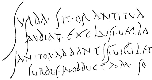
The most famous is tablet 291 with a birthday invitation from Claudia Severa. Her letters are mainly used as a model for the font.
The elegant script in which this letter is written is also probably to be recognised in 243, 244 and 248. The letters are slim, with marked ascenders and descenders, and very little use of ligature. [5]
The goal of the font is to combine the specificity of lettering in handwritten documents with the beauty of regularity in the typographic era. In this sense, the task of creating a font is similar to the one pursued in the creation of the antiqua. In the era of creating typefaces for early book printing, typographers also focused on how letters were handwritten, but the letters were uniform and didn’t look too varied.
Vindolanda font is a modern sans-serif font that is designed in a unified style. Its character is determined by the antiquity and manuscript character of the prototype 1, and at the same time by the opposite trend: the modern appearance of mass-produced fonts.

B. Voronetsky and E. Kuznetsov say on ancient Greek writings:
It is unusually simple, built sparingly clear lines of uniform thickness. [6]
I’m aiming for the same stylistic guidelines when I’m working on the Vindolanda font.
They also write about the Roman font:
Roman font was not something uniform and constant: it was noticeably modified and existed in various forms. Its basic and original form is the capital font (lat. caitalis – large, main, solid), also called majusculus (lat. majusculis – somewhat larger), because it consists exclusively of capital (large) letters. An inscription made by majusculus is placed strictly between two horizontals, without a single line going beyond the line formed by them. Majuscule is, first of all, the font of solemn writings carved on columns, triumphal arches and walls. (…) Its technology (…) is careful slow carving in a stone slab along a predetermined contour. (…) He is clear, harmonious and stately. (…) Another variant of the handwritten Latin writing was cursive (lat. currêre – to run; running, means slanted). In cursive, letters were simplified, joined together, and lost some details. Quickness was achieved at the cost of loss: clarity, clarity, beauty suffered. Therefore, italics (in its various forms) was used only for business records and letters.
Vindolanda returns clarity and precision of Greek writings to Roman cursive [7].
Thus, it is not necessary to appeal to modernity to justify the need for this typeface.
A very similar writings could be found in other places, e.g. in Pompey 2.
In addition to the letters of the Latin alphabet, the font contains the letters of the Cyrillic alphabet and the extended Cyrillic alphabet for minor languages such as Bashkir, Tatar and Udmurt. These letters were created for entertainment purposes and have no historical basis. They represent only my fantasies on how the Cyrillic alphabet based on Roman cursive could have been look like. Nevertheless, the Cyrillic letters are based on the Latin letters in one way or another. How they were designed is explained in a special section in this document.
This fancy Cyrillic was created out of a desire to make the typeface more usable and out of a desire to popularize the Roman cursive lettering.
The font can be used for more authentic reproduction in books and on websites of texts written in Roman cursive, as well as for educational purposes to practice reading texts written in Roman cursive. The font can also serve as a secret spelling for kids who want to start their own private club, like in the “Dead Poets Society” movie.
Traditionally, letters are drawn on the background of a grid of 16 squares proposed by A. Dürer to show their correct proportions 3. But the very nature of cursive contradicts this idea.

Vindolanda is a disproportionate, fractured typeface in which the free spirit of hand-drawn letters is slightly reduced to the order we know from book printing. And it is in these fractured lines that the archaic beauty of this typeface lies. The result is something between ancient runes and the constructed writings of space civilizations in sci-fi movies 4.

Let’s compare original letters from Vindolanda and letters from Vindolanda fontface, starting with the letter A 5.

One of the most unlike letters we’re used to 6.

It was very important to keep the angle of the stem 7. Through such lettering, we better understand the history of letters. The C was not always rounded. It was written in two linear movements. In cursive, this method is captured.

The letter D had to be modified a bit to keep the overall character and uniformity of the font, it became more like A and B 8.


Sans-serif fonts are not only sans serif. They also tend to have stems, hairlines and bars of equal thickness. In general, this rule is followed, except for the letter L, in which the seal in the crossbar emphasizes the origin of the letter from handwriting.

It was a challenge not only to draw the letter Q, but even to find it on tablets from Vindolanda [8]. It is here, but it is very different from the other lettering. I had to change the appearance of the letter and adjust it to the general character of the font 11.

Letters U and V are the same.

The letters Z and Y are very rare, I have not been able to find them on Vindolanda tablets [9]. But I was able to find one use of the letter X 13. They all came into the Latin alphabet from the Greek alphabet, and letters in Vindolanda did not need scholarly Greek words. Letters were used to solve everyday problems there [10].

Not only should the letters be similar to the original writing, they should also look good next to each other, without leaving gaps or overlapping. Kerning is used for this purpose. The appearance of the letters is different from the usual ones, so regular kerning pairs could not be used.
The following letter combinations require kerning:
E
F
R
C
Also K, L, I and other need kerning.
Typically, fonts are demonstrated using pangrams. But is there a pangram for Latin? This is a bit of a complicated question, internet users try to answer it here. Let’s take advantage of their findings 14.

The translation I see floating around the internet is odd, though: Thus fleeing, O leader, you are regarded with jealousy like Karus.
And one more 15.

Free translation: Young king with simple face and hair, this is how you are given every letter through this lyrical form on the first day of the month.
Now let’s try to type an original birthday invitation from Vindolanda’s tablet 16. See original here.

I have no idea what Cyrillic characters might look like in this font. The Slavs would not have a written language until 700 years later. Although there is a place in the Slavic area with similar soil features [11] that allow ancient manuscripts to be preserved for archaeologists [12], the writing technique in Novgorod was different: in Vindolanda they wrote with ink on wooden tablets, while in Novgorod the letters were scratched into the bark of the tree [13]. Therefore, direct analogies in the appearance of letters are impossible. So it’s all pure fantasy 17.

В in the mirror image of Б, Г goes back to С, as it has historically, Д is two mirrored G’s, the other letters are simply drawn in single sharp strokes.

The font is made in Glyphr studio. You can download the project sources and work with them yourself.
I am grateful to Mariia Timoshchuk, who introduced the Vindolanda tablets to me, and who supports me in my interest in Latin.
18cent A typeface based on a historical typeface used in 18th century typography, but was sought after as an illustration of brokenness and lack of mental balance in the credits of a movie about Tchaikovsky’s wife.
Font and writing system for a constructed language for the birthday of M. Daniel